


- 04
- 2017-12
New corporate logo released by General Real Estate
Publisher:OfiiceViews:
On February 3rd, 2017, Beijing General Real Estate Development Co.,Ltd. released a new corporate logo, greatly updating the original logo to comply with the company’s cultural values and modern service philosophy.
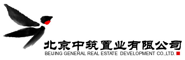
The original logo of General Real Estate is interpreted as follows:
The corporate logo of Beijing General Real Estate Development Co., Ltd. (General Real Estate for short) is a flying swallow, which symbolizes that the business of General Real Estate develops constantly and has a bright future. "Building a good nest with love" is our praise to swallows and also the core connotation of the corporate .It symbolises that our employees are as committed as the swallows to building nests with love for millions of people.
The swallow in the logo is made up of several bamboo leaves, which in culture symbolises two things. Firstly it reflects our philosophy of admiring nature, and the harmony that coexists between mankind and nature when we develop projects. Secondly, the green bamboo is strong, durable and everlasting much like the company itself."The nodes (principles) are already there before bamboo is out of the ground. However when it reaches to the sky, it is still hollow inside (modest)", is a truthful description of the bamboo, and a reflection of the outstanding character and sentiment of the Chinese nation. It is also an aesthetic choice and moral standard for employees of General Real Estate to follow the principles of honesty & integrity and learning & progress in their affairs and conducts.
The logo is simple and elegant, with a great atmosphere of humanism. The wash painting method in traditional painting is used to design such a logo, which gives an elegant and vivid enterprise image that cares for nature, and makes the enterprise concept of being active, pragmatic, united and win-win organically integrate with the traditional culture.
In the logo, the vermilion under the swallow's jaw seems like a beating heart, serving as the finishing touch. In the logo extension, many swallows rush out and seem magically changed from bamboo leaves, with red hearts flashing. The movement and quietude are appropriate, and the shape is extremely dynamic and aesthetic.
The updated logo is interpreted as follows:
Swift: The shape of the logo originates from the swift, which can fly all the time with little rest. Its disposition of never stopping and challenging a new height bravely implies the spirit of pursuing perfect architectures of General Real Estate, who behaves like a swift all the time to build sweet homes for every customer with concentrated attention.
bamboo:There is an ancient poem in China that says “The bamboo shoot (which symbolises principles) is already there before the bamboo is out of the ground. However, when it grows tall, it is still hollow on the inside (this represents humility)”. This gives an insight into the nature and character of the Chinese people. It also reflects our employees’ high ethical standards of honesty, integrity and a commitment to learning.

Logo change is one of the signs indicating that we are getting to well-developed. The new corporate logo witnesses that we will become an excellent and integrated service provider for development of real estates by building good houses with love.